In this week, I have been learning about some of the 12 principles of animation that were taken from the works various animators throughout the 1930’s and onwards. Those 12 principles were first published in “The Illusion of Life: Disney Animation” book made by Ollie Johnston and Frank Thomas. We also mentioned the types of animation, including 3D animation, traditional cel animation (Celluloid sheet), 2D animation and stop motion. The principles of animation that I did learn about are: pose to pose & straight ahead, squash & stretch, anticipation, staging, follow through and overlapping action.
Pose to Pose and Straight Ahead
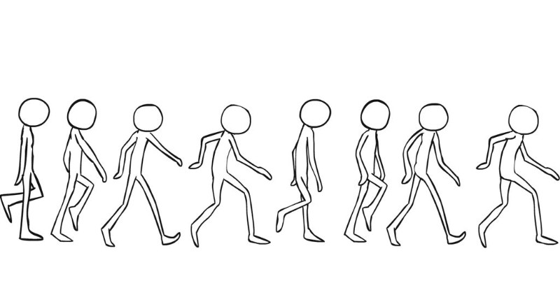
Pose to pose animation refers to the planning of poses that the character will make when performing an action or motion. Keys are the start and end poses of the animation and they are a base for the other frames to be built upon. The second type of poses are extremes, which are near the keys and right in the centre point between the keys, these basically show the furthest points of travel that a character will move in. The third type of poses are breakdowns, which basically connect the keys and the extremes together. The final type of poses are in-betweens, which are similar to breakdowns but the main difference being that they are in between the breakdowns, extremes and keys if an animation wants to be smoother.

Straight ahead animation is basically where you start from the first drawing and continue until you want to finish your animation. An example of this would be if you want to animate something like fire or water as these would move pretty unpredictably in real life. This method is not that good for character movement however as there are limits to the amount of frames you can do for each animation and in the case of straight ahead, you might not get the amount of movement you want in the right amount of frames. However, an animator is not limited to the amount of frames they can use and should work at different rates of animation.
Squash and Stretch
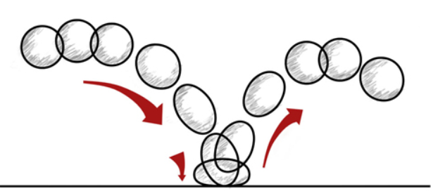
Squash and stretch is a fairly self-explanatory principle that involves making an object impact a surface and stretch out its volume in the process. This is done to create to make an object have a more dynamic form, alongside flexibility and life. If exaggerated more, it creates a more stylised look. The best way to be able to do practice this is through animating a ball bouncing off a surface such as the floor as shown in the example below.
Anticipation
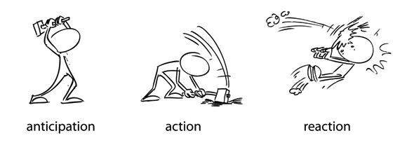
The name of this principle is very self-explanatory, it involves creating a frame/pose that is a characters preparation or wind up just before they do an action (like running or throwing for example). Without this, it is very hard for a viewer to follow the action and makes it look weak as a result of that. This is due to energy having to come from somewhere as it would not make physical sense someone did a punch out of nowhere.
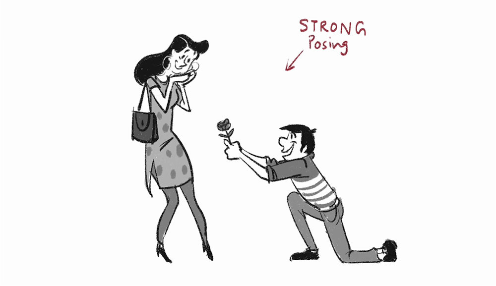
Staging
Staging is the principle that covers the expression of a subject, idea or action that is clear to the audience, like with the other principles, this principle should and can be used in combination with other principles wherever possible. A few techniques used in this principle include the line of action, timing, camera movement, the rule of thirds and simplicity.
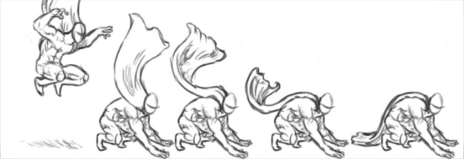
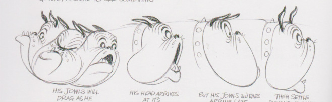
Follow Through and Overlapping Action
Follow through basically talks about how body parts continue to move even after a character has stopped moving. On the other hand, overlapping action refers to lag between any other part of the character and their main body, for example a coat that flaps up when the character moves. This principle is important as without it, the character will look robotic lifeless and also in reality, not all of the energy from an action will be lost instantly even if the character was going to be robotic as this is based on real physics.
Animation Artboard process
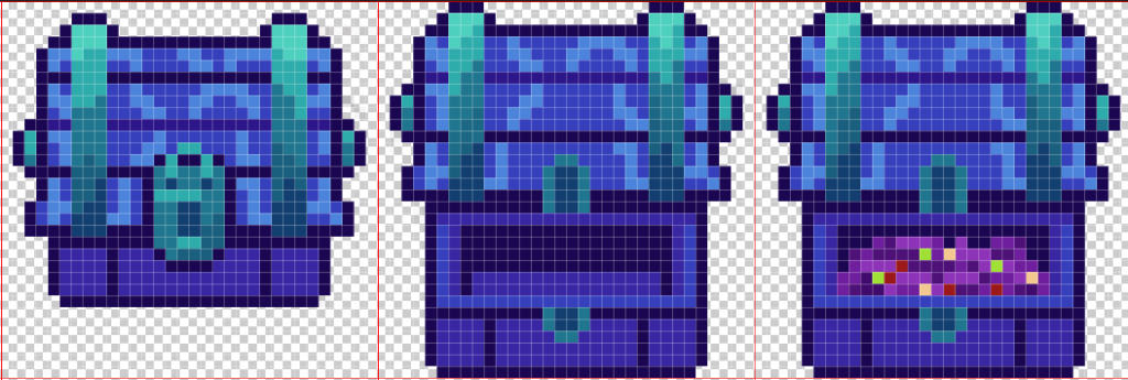
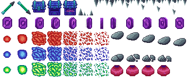
So for this week, I was tasked with creating either an object or character artboard for a simple 2D platformer game. In this instance, I decided to do an object/environment artboard since I wanted to create animations for objects instead of characters (even though that might change soon). To start off with, I created a new photoshop document and made it 384 by 384 pixels in size with a set background to transparent. I then went to edit, preferences and clicked on grids and guides and set a grid with 32 by 32 pixel squares and 1 subdivision and downloaded the huemongous palette from the loscpec website to be used in my photoshop project.
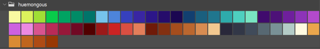
Since I wanted to focus on objects and the environment, I started off by drawing a basic arrow that points in two opposite directions. I used a combination of greens and greys for this as the huemongous palette mostly consisted of cold colours, such as magenta, green-blue and purple, with a few less refined red colours and greys. The reason as to why I chose an arrow for this is because the artboard consists of fantasy elements such as mysterious chests, coins and pots. My coins are a purply-magenta colour as I thought they would fit in well with the aesthetic of this artboard and the colours that I created the chest with (cyan, greens, and blues). I decided that I would animate my coins in 2s (12 frames per seconds) as it would appear as motion for the player visually and I was limited to create up to 12 frames in my artboard. On the other hand, the chest only has 3 frames as I do not think it would need any more to be honest.

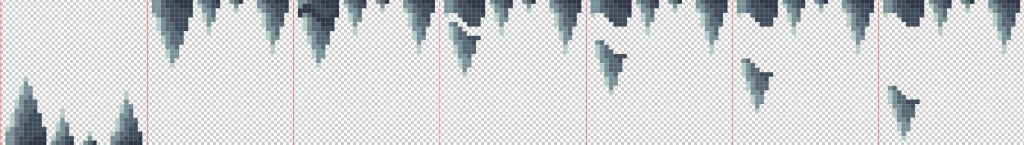
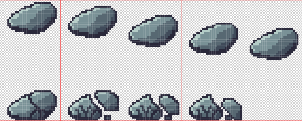
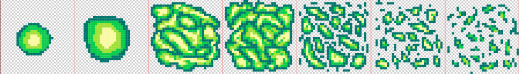
I also did falling boulder and falling stalactite animation frames and the stalagmite sprite in this artboard as the environmental hazards. For both of these I just chose greys so that they look more realistic and look more like rocks and solid structures. Just like with the arrow, I also used shape theory for the stalagmites and stalactites as I wanted them to look sharp and dangerous to the player, so I decided to make them triangular in shape. For the boulder I wanted it to be portrayed as heavy so I decided to make it break upon impact with the floor (as seen below), with a bit of cracks in parks of the rock that did not break off the rock. I did this because I wanted to simulate real world physics which state that the heavier an object is, the more strain it will have from gravity.
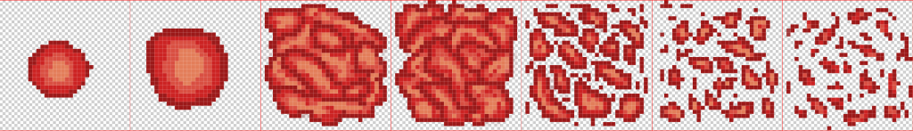
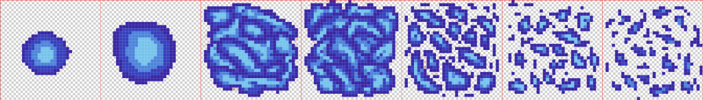
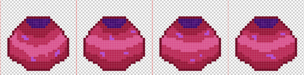
For my explosion, I decided to make it with three different colours to see how it looks, the first one that I made was the red one as I wanted as more warm fiery effect on the explosion, but that did not work out well so I decided to go with blue for my next attempt and the then a green one after that Overall, I think the blue explosion is the best as it matches the colour theme of the artboard (unlike the red one) while also looking more like a fiery explosion than the green one, but I might change my mind in the few weeks depending on my thought process during that time. For the pot, I simply used a mixture of pinks for the pot itself and purple for the contents that are inside of the pot, with each frame being only slightly different as I only wanted it to spin around without moving that much so that was my way of approaching this. I do know that I was not following the colour scheme for this particular object, but I wanted to do something out of the colour scheme to make it more noticeable in game so that the player would be curious to pick it up or go up to it to have a look at it.
Conclusion
This week, I think I did great at my designs and really thought about the colours and shapes that I was going to use for the sprites. I may be able to use a few of these for some of my games in the future, depending on the colour scheme of the game that I will be making. I should have also added some characters like enemies or the player themselves into this artboard to make it more interesting, but at the same time that is something extra that I could do at any time I wish to. I also noticed that I did not add enough shading on my chest sprite, which I think would have made it look better but it is a small little detail that I did not pay attention to that I could definitely improve on if I come to use this sprite in one of my future games.
References
(1) AnimDesk (2012) The Principles of Animation – Squash and Stretch – AnimDesk Blog. www.animdesk.com. Available online: https://www.animdesk.com/the-principles-of-animation-squash-and-stretch/ [Accessed 2 Dec. 2022].
(2) Becker, A. (2015) 4. Straight Ahead & Pose to Pose – 12 Principles of Animation. YouTube. Available online: https://www.youtube.com/watch?v=v8quCbt4C-c [Accessed 2 Dec. 2022].
(3) BRENYONRAMBO (n.d.) Huemongous Palette. lospec.com. Available online: https://lospec.com/palette-list/huemongous [Accessed 2 Dec. 2022].
(4) MAKO (2017) Steam Community :: Guide :: 12 Principles of Animation. steamcommunity.com. Available online: https://steamcommunity.com/sharedfiles/filedetails/?id=899499881.
(5) neeru (2016) Staging. D’Source. Available online: https://www.dsource.in/course/principles-animation/staging [Accessed 2 Dec. 2022].
(6) Pinterest (n.d.) 2. ANTICIPATION | Principles of animation, 12 principles of animation, Animation. Pinterest. Available online: https://www.pinterest.co.uk/pin/685250899530308519/ [Accessed 2 Dec. 2022].
(7) Undgsm (2018) CSS and Javascript animation in web design: What you should know. UndsgnTM. Available online: https://undsgn.com/css-and-javascript-animation/ [Accessed 2 Dec. 2022].