In this week I have been learning about pixel art and the multiple different techniques used in it. Pixel art is the process of placing a square block of colour on a restricted canvas that is often worked on in powers of 2 (for example 8 x 8 pixels and 16 x 16 pixels). The colours and details of pixel art are simplified because of the lower resolution and the objects within the art itself often start being made by being broken down into simple primitive shapes (squares, triangles, circles). Also, pixel art can’t gradient as smoothly as a full scale image can, however there are other techniques used for shading, such as dithering. Dithering is the process that creates shading through patterns to make objects lighter or darker in appearance, the amount of dithering can affect the brightness or darkness of the shading and it can be used to make an image have a more retro/stylised look to it. Dithering should be used sparingly as using too much can make the image not look the way in which a person anticipated it to be.
Platformer Player Sprite
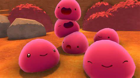
I started out by trying to find inspiration for my character through the internet and other sources, I already had an idea for my player character to be a blob similar to the slimes from the game ‘Slime Rancher’ as I wanted the player to be simple to draw and animate later on. So, I decided for my colour palette to be a mixture of cold colours (green, blue and purple) as I wanted the game to be based on an alien world where you fend off enemies by jumping on top of them and also avoid obstacles such as spikes in your path. I ended up making my character a purple colour as I think that it would fit the aesthetic of my game pretty nicely, especially since I am using a mixture of cold colours. I have also made multiple frames of the player for the idle, moving left and moving right animations since I do not want a character that is only a single image with no animation at all (all of the images can be seen below). Player Moving Left animation is shown on the left, Player Moving Right animation is shown on the right and Player Idle animation is shown below them.


I think the player character turned out to look pretty good, although I think I should have gone for a different colour instead of a purplish-blue that I ended up going for, as I think a green colour would suit my character pretty well as it’s often more symbolised as a peaceful colour rather than purple. I should have also thought about the shading a little more than I did as I ended up doing as it’s pretty obvious that it’s not blended well, which is where I think I should have applied dithering to in order to make it flow a bit more than it does in the final product.
Platformer Tiles
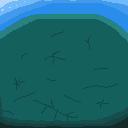
The next things that I have made were the two different types of tiles for the platformer, since the player would have to move on something. So to start off with, I have made a grassy type of tile that would be the base ground which the player would start on. I made this tile with a mixture of greens and blues since I wanted the top of the tile to look like grass and the bottom part to resemble a type of mud. I stuck with the brighter edges being on the top left of the tile since it made sense and show where the light from the game is coming from. For this tile, I think it looked good, although I think I should have shaded the top left of it a little more, like I did for the bottom right, but just with the opposite lighting. An image of the tile can be seen on the bottom left.
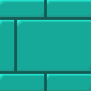
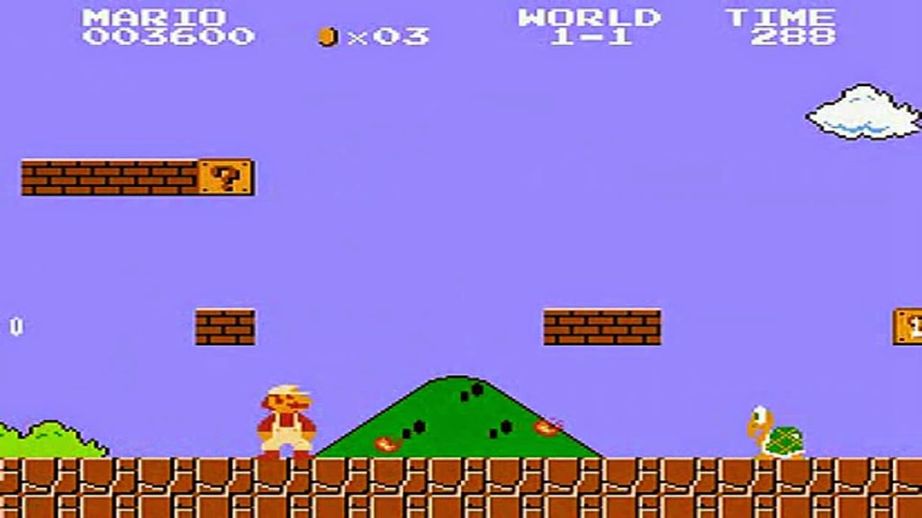
The tile shown on the top left is the second tile that I have made and I think it turned out pretty well, however when I was putting the tile next to another copy of the tile they did not seem to connect that well, which suggests that I may have gone a bit over the top when shading the tile. Like seen above on the right, this tile is coloured in a cyan/green colour, since I wanted it to blend with the rest of the game well, as I was primarily using cold colours for this game, which I think I did a good job at as the game lacks in any colour otherwise (except for the players eyes as they needed to have a clear contrast). The main inspiration for this tile was from the 1985 Super Mario Bros game, since I wanted to make brick tiles for my game and that game in particular is the most popular example of a utilisation of this.
Platformer Enemy Sprite
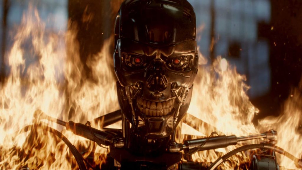
The next sprite that I have made was the enemy sprite, for which I took inspiration from ai based movies such as terminator since I wanted the enemies to be evil robots that are pursuing the player and trying to kill them. I decided to make the enemy player green as it fits the colour scheme well but it also creates a contrast against the player who is purple in colour. Whilst green can signify nature and peace, it can also signify the hatred and envy of a character, which is exactly what I was aiming to show through the enemy sprite. This sprite also has an idle animation but it doesn’t have animations for moving left and right like the player does, which is fine since the enemy would not move as much as the player would do. The frames of the enemy idle animation are shown just below.


Overall, I think this turned out pretty well and almost how I wanted it to look, even though I should have made this character a red colour to make it stand out from the background and the tiles so that the player can immediately identify it as an enemy. Like in the player sprites that I made, the lighting is very noticeable and is not blended properly, which is why I think I should have also used dithering on this like I did with my spikes later on down the line.
Platformer Spikes
To create these spikes, I decided to take inspiration from the tutorial videos I was following whilst I was making the platformer game but made sure to make the spikes a mixture of magenta/purple colours so that they would stand out from the tiles and be noticeable by the player when they come across them. I did not need to make an animation for the spikes as they would simply stay in one place, unlike the player and enemy sprites that would constantly move about. The spikes are shown just below.

Overall, I think that these spikes turned out much better than the player and the enemy sprites, as I included dithering and more shading into these spikes, which makes them stand out more. However, I do think that the spikes can be improved by maybe not spacing them out the way that I did, but at the same time I think that was the better choice at the end as I could hide that through the tiles that I created.
References
(1) Monomi Park (2017) Slime Rancher [Video game]. Available online: https://store.steampowered.com/app/433340/Slime_Rancher/
(2) Nintendo R&D4 (1985) Super Mario Bros. [Video game].
(3) The Terminator. (1984) Orion Pictures.