In this week, we have been learning about composition and perspectives and how they impact the way in which audiences view the artwork. For example, a one point perspective drawing has a single vanishing point and all surfaces and edges from the drawing move towards that single vanishing point whilst a 2 point perspective drawing has vanishing points with 2 sets of lines that are kept parallel and so on. We’ve also learnt about what isometric and orthographic drawings are. Isometric drawings are functional drawings that have a parallel projection with vanishing points that seen infinitely far away and with objects that stay the same size throughout, while orthographic drawings are accurate 3D object drawings which involve drawing an object from its front to its back, from its top to its bottom and from its left to its right. We’ve also been focusing on making backgrounds for the top down shooter prototype that we are going to make soon.
One Point Perspective Drawing
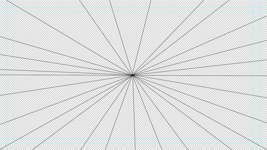
I started off by experimenting with one point perspective. A one point perspective drawing is a drawing that leads from a single line along either a horizontal or vertical axis. So, I headed to photoshop and drew out a single line in the horizontal axis as shown below. Then I decided to draw out a bunch of diagonal lines that meet up at one point in the horizontal axis that I’ve created through the line I drew earlier (also shown below).
After sorting out the lines that I would use as a starting point, I changed the opacity of each individual line so that they’re barely visible on the canvas and then drew a bunch of cubes and cuboids along with a square based pyramid in the centre of the image. Then, I decided to connect the separated shapes by drawing out lines to connect then by their corners, this ended up looking a bit odd visually and that is exactly how I wanted it to look. I filled out the cubes, cuboids and the square based pyramid in shades of red and then filled out the rest of the gaps left out by the lines I drew in different shades of green so that that there would be a great contrast between the shapes and the rest of the image. This resulted in the image that can be seen just below.
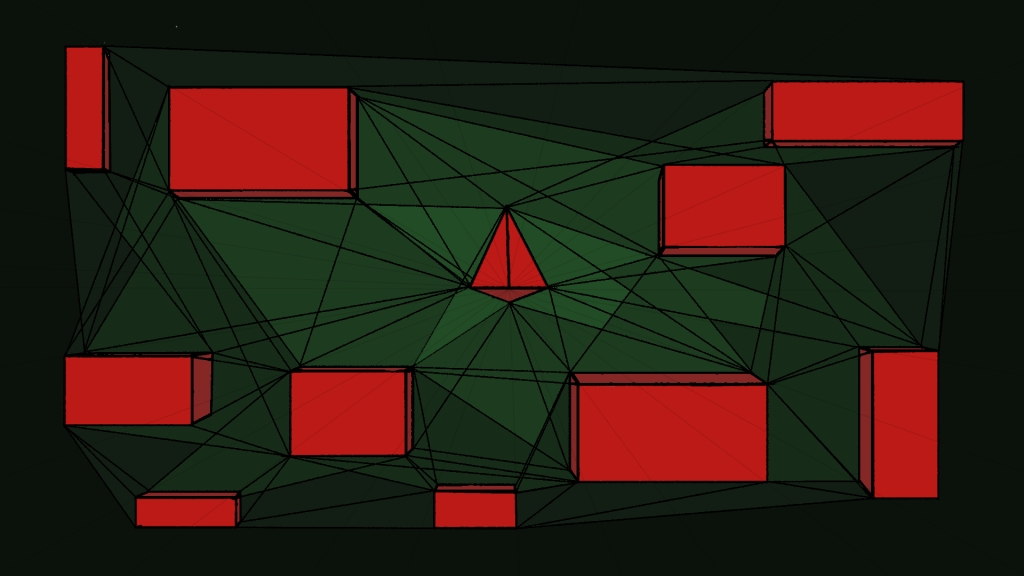
Overall, I think that my perspective drawing ended up looking pretty good, the contrast of red and green make the shapes stand out more and therefore make them a main point of interest for the viewer. One thing I did not like about this however was that the lines I have made were particularly frustrating to work with, as when I was filling out the gaps in between the lines there would still a massive gape between the lines and the filled shape, so I had to go back to the shape so that I could clean up the edges of the fill. This got so irritating to the point that I decided to fill out the lines in black to not have to deal with that issue, this worked kind of, but there were a few parts which I still had to clean up due to the selection tools being pretty annoying when selecting parts of an image.
Top Down Shooter Background
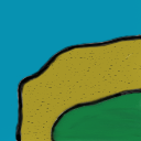
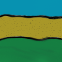
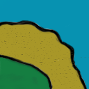
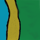
After making the one point perspective drawing, I decided to start off with making the background for my top down shooter game that I would be making later on. So, I started off by making multiple artboards that were 128 by 128 pixels in size on a new photoshop project and started drawing multiple different tiles for the background, including corner pieces, side pieces and any other tile pieces for the game. I decided make these tiles with a mixture of blue, green and yellow so that the finished background would look like an island which is what I was aiming to make. Images of the tiles can be seen just below.

After making the tiles, I went onto another photoshop project and made a canvas that was 1920 pixels by 1080 pixels in size and placed my tiles onto it. I made sure to resize the tiles so that they would fit exactly on the grids I set up on the project and that I could just duplicate these on the same project with the exact same size. I’ve also cleaned up the copied and uncopied tiles so that they would like they are one background by using the brush tool and selection tools. The final product of this can be seen below.
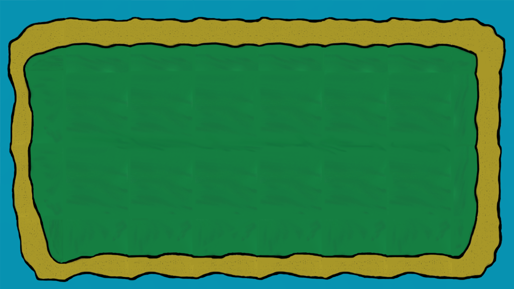
Overall, I think this background turned out pretty good at the end, although I should have used a different technique to what I have used here in order to get a better result than what I ended up with. Also, could have blended the green grass part of the background as it does look like it was created by multiple tiles but I think I did a good job at covering that up otherwise.