In this week I’ve learnt about how shapes and colours can have an impact on what the viewer thinks of an artwork. For example, red can represent anger, danger passion or even care whilst a circle can make something or someone seem soft, squishy and harmless. I’ve also recalled that the value of a colour is how bright or dark it is before hue and saturation are applied to it.
By using what I’ve learnt from this week’s lecture and the lectures from the weeks before, I drew a player character sprite, an enemy character sprite and a knife sprite (as a replacement for a bullet). For the player sprite, I decided to base it off from a bunch of circles, since I wanted to let the player know through the design that it’s the sprite that they would be controlling, and I added different shades of green onto the player character to emphasise that they’re a healthy individual (image shown below on the right). I based it off from a character from another topdown shooter game as seen below on the left, but I decided to change a few things since I don’t like copying designs by brightening up the colours in my player character design.
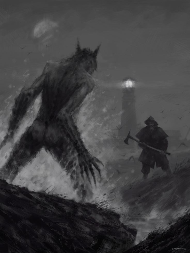
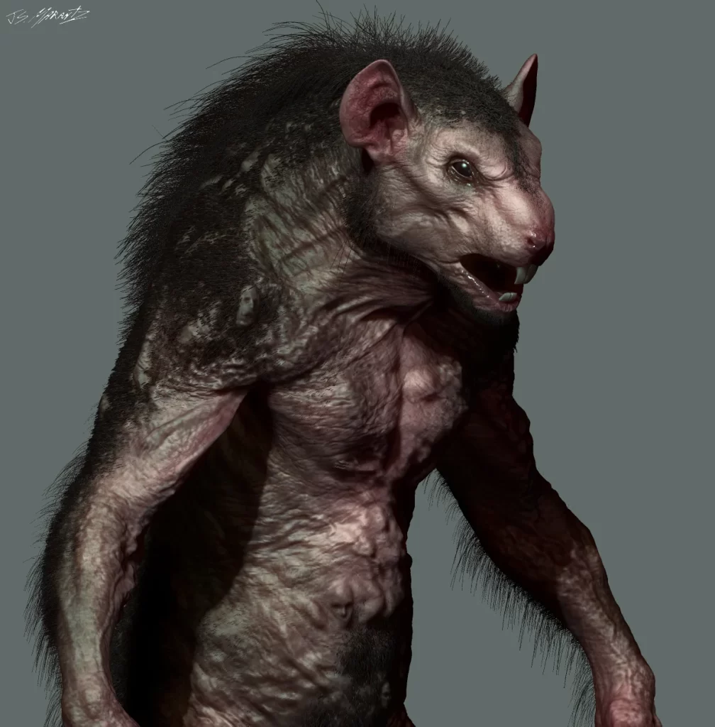
For the enemy character sprite, I originally decided for it to based off from a werewolf since I wanted to create something new and interesting for this particular game type. However, I decided to scrap that idea as I tried to draw the enemy as a werewolf but instead looked more like a human-rat hybrid, so I decided to stick with that instead. I’ve created 3 different enemies which would be coloured differently to each other. I coloured the first enemy type as blue so that it would signify that its a much slower enemy in comparison to the other two enemy types, which are the more dangerous enemies. I coloured the second enemy type as orange, so that it would symbolise that it’s a moderate threat to the player, in comparison to the first enemy type which isn’t as dangerous as it. Finally, I coloured the third enemy type as red to symbolise that it was the most dangerous enemy type out of the three enemy types that exist, so that the player would be aware that that enemy should be prioritised over the other two enemy types. As a final note, I also made the heads of the enemies as a triangular shape so that they would be seen as a danger to the player. The enemy sprite images are just below (enemy 1 is on the left, enemy 2 is in the middle and enemy 3 is on the right).
The knife sprite design is pretty self-explanatory, I created it as a triangular shape to symbolise that it’s sharp and directional whilst also being unpredictable. I decided to stick with greys and blacks for this particular knife as there isn’t much to say about it other than it’s a knife and it’s sharp, so it could be used as a weapon. Image shown on the left.
References
(1) CC-BY 3.0 and Gombart, R. (2015) Animated Top Down Shooter Survivor Player. OpenGameArt. Available online: https://opengameart.org/content/animated-top-down-survivor-player.
(2) Grimm. (2011) Universal Television.
(3) Rozalaski, J. (2019) The Lighthouse Keeper. Tumblr. Available online: https://www.tumblr.com/we-are-hunter/188461715330/the-lighthouse-keeper-inspired-by-the-amazing.