This week, we have been learning how to create UI buttons for our cookie clicker prototypes that we are creating this point in time by using both adobe illustrator and adobe photoshop at our disposal. I decided to base my cookie clicker game on peaches, as I wanted to be original since I didn’t want to copy any other cookie clicker game that already existed. I mainly got inspired by James and the Giant Peach (1), as it’s the only popular story based on peaches and also peaches aren’t really used in games that much so was a good opportunity for me to create a game based on something that isn’t really popular in the gaming industry.
In Adobe Illustrator, I used various different tools such as the gradient tool and the 3D objects tool to create the buttons where the upgrade text would be and made them a peachy colour to make anyone that played my game recognise that this is a game about peaches. I also researched text fonts on dafont and they eventually chose the tango sans font as I liked the look of it and is also readable. I then downloaded the tango sans font so I could use it later on in unity when I finally finish creating the mechanics of my peach clicker game. I also decided to make sure that my font would be blueish purple to contrast the colour of my peach UI buttons so it would be more easily readable.

I also made my peach UI button in a similar way that I did for my other UI buttons but instead of making it rectangular, and made it more circular to match the shape of a peach. After I finished creating the buttons in Adobe Illustrator, I exported them individually and edited them (by clearing out the background) on photoshop saved them as PDFs. When interviewed doing my peach UI button however, I decided to edit it a bit more so that it looks more like a peache instead of it being just a circle. So, I cleared the background of the peach and erased the top part of the circle a bit. I also drew a leaf just where I erased a bit of the circle using different shades of green just so that it would look better visually. I then saved it as a PDF like I did with all my other buttons so that it would have a clear background in game.
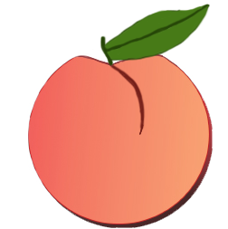
Overall, I think that my UI buttons turned out to be good I’m pretty proud of them. However, I didn’t do so well when clearing the background from the peach UI button as I noticed that there is a small line of white on the left side of it. This may have been due to the fact that I was messing around with various different tools when trying to edit the peach UI button or the fact that I was too focused on making my peach look like a peach which made me not notice the mistake that I’ve made. The tango sans font that I’ve chosen on dafont was a good choice of font in my opinion, though I should have tried to create my own font on LingoJam or FontGenerator.com just so that I’ve got that font in case I need it. Despite all of these issues, I think that the my UI buttons stand out from the typical UI buttons found in a cookie clicker game and I’m quite happy with that.
References
(1) James and the Giant Peach. (1996) Walt Disney Pictures.